Effective dashboards bridge the gap between technical metrics and business outcomes. At VirgoSoft, we've learned that the most valuable dashboards are those that both engineers and business stakeholders can understand and act upon. Here's how we approach building data-driven dashboards that serve both audiences.
Understanding User Needs
Before building a dashboard, we identify who will use it and what decisions they need to make. Engineers need technical metrics like API response times, error rates, and system resource usage. Business stakeholders need KPIs like user growth, revenue, conversion rates, and operational efficiency. We design dashboards that present the right information to the right audience at the right level of detail.

Real-time vs. Historical Data
We distinguish between metrics that need real-time updates and those that are better served by periodic refreshes. System health metrics require real-time monitoring, while business KPIs can be updated hourly or daily. This approach reduces unnecessary load on our data infrastructure while ensuring critical metrics are always current.
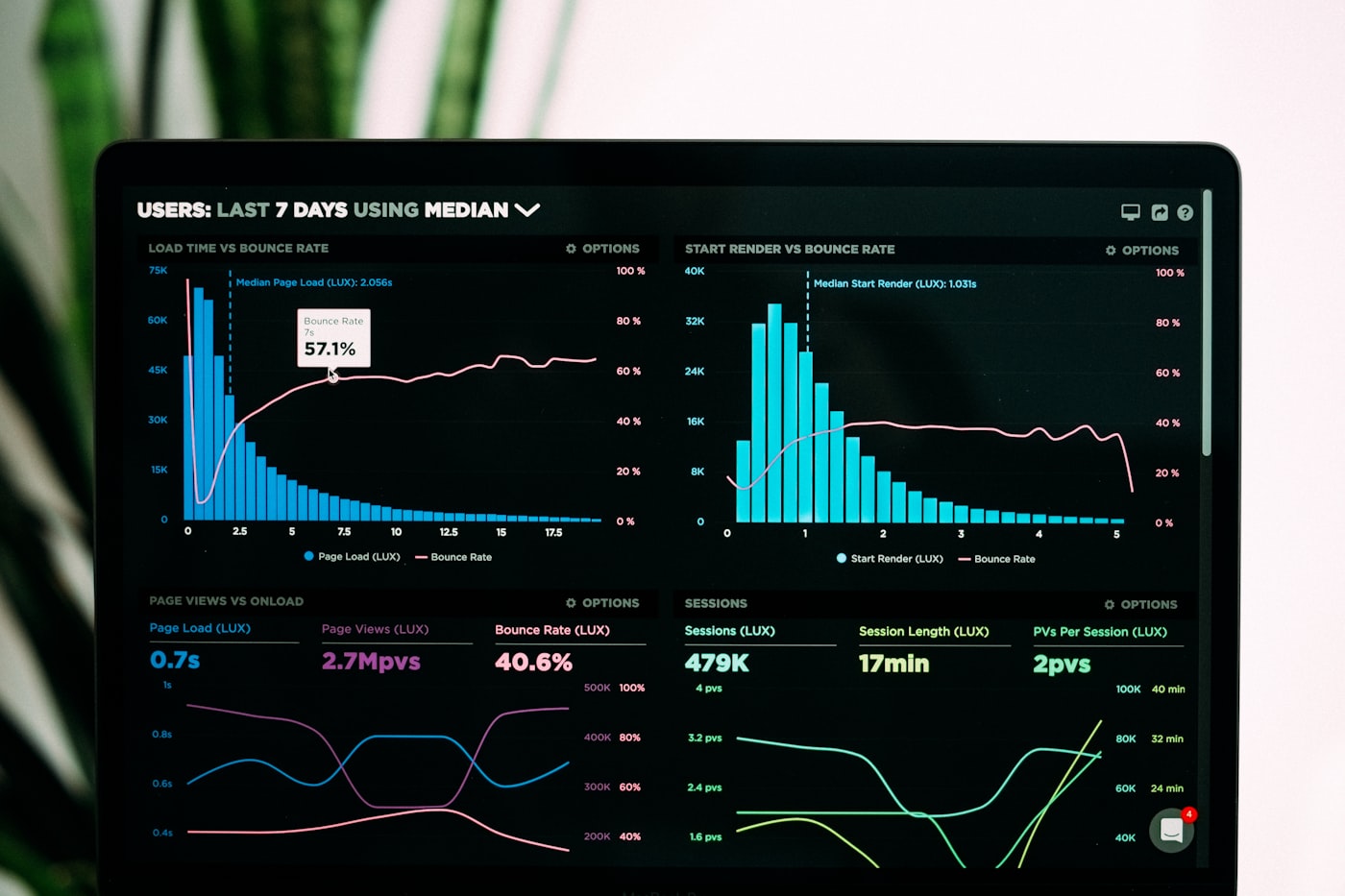
Data Visualization Best Practices
We use appropriate chart types for different data types. Time series data is displayed as line charts, categorical data as bar charts, and distributions as histograms. Color coding is consistent and accessible, and we avoid information overload by limiting the number of metrics per dashboard. Interactive filters allow users to drill down into specific time periods or segments.
Performance Optimization
Dashboard performance is critical for user adoption. We pre-aggregate data where possible and use materialized views for complex queries. Caching strategies ensure dashboards load quickly even with large datasets. We also implement lazy loading for charts that aren't immediately visible, reducing initial load times.
Actionable Insights
The best dashboards don't just show data—they highlight what matters. We use alerting thresholds to draw attention to anomalies or concerning trends. Contextual information helps users understand whether a metric is good or bad. We also provide drill-down capabilities so users can investigate issues or opportunities directly from the dashboard.
Integration with Workflows
Dashboards are most valuable when integrated into daily workflows. We embed dashboards in tools teams already use, whether that's Slack notifications, email reports, or direct links in project management tools. This ensures stakeholders stay informed without having to remember to check dashboards regularly.
By focusing on user needs, performance, and actionable insights, we create dashboards that become essential tools for both technical and business decision-making. The key is continuous iteration based on user feedback and evolving business requirements.